Post by Yoona Im on Jan 7, 2012 22:32:13 GMT -5
Hello Final 8!!!
This week, one of you will be eliminated from the competition. It's getting tougher week by week. And personally for me, it was the toughest ranking to date. I even like the photo that I ranked last this week but I have no option and this is a competition after all.
Let's start our Judging Session now!!!

Émilie: It's nice to see something different, and unexpected from you, but "Mona Amber", maybe not quite that masterpiece. I am loving the dress and the setting, and there's a lot of story going on here, it's quite artistic too. I love that your pose is emphasising your curves, and giving you a lovely hourglass figure, and your face shows a lot of passion. I think this photo would have been taken to the next level with a little bit of neck extension.
Alex: This is super good. I like how not only the background is artistic but your artistic. The boob sticking out is a tad distracting though.
Amanda: I don't like your "Mona Amber" label. This is not at all a conservative image like the Mona Lisa was - this is over-the-top sexy, which is not exactly "artistic" unless you're talking about something that rhymes with "warn." I don't like how your dress is the same color as the wall - it makes you blend in more - and I think you've used a little too much bronzer. The boob is a bit too trashy for this to be showcased at a photographic art museum, and the painting in the background pops more than your face does. Despite that, I don't hate it - but I don't love it either.
Yoona: I love the whole concept. It's very artistic and dramatic at the same time. But I think this would look so much better in Black & White. Tone down your hoochie-ness a little bit.
Émilie: I honestly don't understand the hullabaloo about the cleavage, we know Amber's style is 50s pin up girl, but I think she does it with class, not hooch.

Émilie: I'm just going to have to face the fact that almost every photoshoot you do is artistic, because this just doesn't seem any different to some of the others. Haha. I love the styling, and the story it's telling here, and I love the emotion you're expressing. However, your legs. One of them is amazing! The other is a tree stump.
Alex: This is really good! I love it. I like your face and your outfit. It's really good.
Amanda: I'm going to have to try and judge this without seeing any of your other stuff, given your style - this is so true to you that it's almost become boring, but it's what the theme calls for. Despite it being nothing new, I love it. It fits the theme perfectly, and the two different doors sort of represent two sides - it works with the legs, Em. It really does. It's not like she can show both of them. This photo is focused, high-fashion, true to you, everything. I do like it, like I have a lot. Good work Ash - Amanda's Devils for life <3
Yoona: Gorgeous!!! The dress is amazing and I love the story in this photo. But be careful with your leg. If you stretch your legs here it would be better because you look a little bit short here. But no matter what, this is another great photo of you, Ash

Émilie: I'm sitting here, staring at this, wondering why it was chosen. I know what you have to offer, Freida, and I can think of at least two photos off the top of my head that would have been better. The artistic element is definitely there, however, it's the filter here that takes away from this. It makes you blend in. In terms of fashion, you do showcase that ugly thing well, but the problem here is your face is so blended in, it just looks like a blob with eyes and lips.
Amanda: This shot has a very high artistic value, and that's good for the theme. I personally do not mind the filter, even if it makes it a bit drab. However, I don't get a high-fashion vibe from this - it's more of an artistic photograph than showcasing fashion as art. Your monochromatic outfit is ugly, and although I like your hair, there's really nothing special about YOU here. You need to stand out more. Make yourself the art in an artistic setting like this! This is just okay - it could be so much better.
Alex: hm, i'm at lost for words. I don't really like your outfit. it's sort of ugly, but i dont blame you i blame the photographer. The good thing about the outfit it it matches the surroundings very well.
Yoona: I think I might be the only one who really love your photo this week. I think it's sensational. I love the lighting, and you connect to the camera very well. The whole concept is very unique and different. Love this photo so much

Émilie: I had to double check all your previous shoots, because I thought I'd seen this before, but the reality was a lot of your photos look like this. IE: Leaning against a wall, left hand over left shoulder, right leg up. I will give it to you that the action here is all in your face. That face is a work of art, and I love the thing on your mouth! It really adds another artistic element to it!
Amanda: The black and white robs a lot of artistic qualities here, especially because there's very little to make up for it. I also concur that we've seen this kind of shoot too much from you - you're against a blank wall, and when we want art, we don't want a plain wall. I personally hate the thing in your mouth too - I don't know what it is, and I don't see any artistic value there at all. I'm sorry Jess, but this is cause for a lot of concern this round.
Alex: I think it's very plain but i like the artistic value of it, i just which there was more. I'm a huge fan of black and white but that alone isnt enough.
Yoona: I think we all have been waiting for something different from you, Jessica. Something that will make us said "Wow". I agreed with other judges that it felt like we have seen this before. But I still think that the artistic element in this photo is very strong.

Émilie: Ah, yes. This looks like it could be a painting from the Renaissance era. I love the styling, and I LOVE your face, and I like the pose. The pose, I just like, not love, because it would've benefited an extension of your torso. But all together, I love the photo.
Amanda: This is just okay for me. It does look like you have an empty picture frame you're trying to fill here, and it does seem like a realistic piece of artwork. I like your dress, but I really don't take much notice of YOU here. I think there's too much space above your head - cropping it down a bit would have improved it a lot. It is fashionable, and it is nice to look at, but that's about it. The pose is just okay, like Em said, and it's really not as memorable as it could have been. It doesn't pop out at all. But it's still good - it just isn't great.
Yoona: The art element was there. I can see this as a paint. I still think you can do better than this. I want the energy from you. A little bit torn this week with your photo

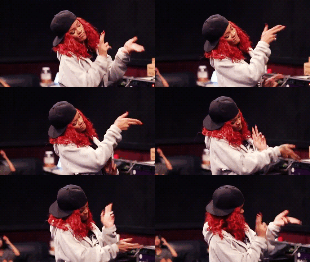
Amanda: I've seen this shoot before. You used it last season. That fact alone robs this shoot of a lot of artistic value - it's a sort of "been there, done that" kind of deal. The black and white also doesn't work the best here - there's little to make up for it. I see your ass loud and clear, but your face is sort of an afterthought for me. Those shoes are interesting and match your hair, but that ties everything together in a way that makes this have virtually no focus. Art is focused. Art has a common theme. This does have a theme, but it just doesn't do anything for me given that you've already shown us this shoot. I expect more next round!
Émilie: Correction, Amanda, she has used from this shoot twice. Remember Haute-Couture?
We all know you have this set, but I would have thought you might use something a little softer. We've seen this hard artistic side of you many times, I was hoping for something soft to balance it out and show your versatility.
This is not a bad photo, it's just nothing new, I'll still be ranking you high.
Yoona: Yup, same problem with Jessica. Good photo but lack of "Wow" factor. I think you can do miles better than this, Rihanna. I agree with Emilie, this isn't a bad photo but we want to see your versatility.

Émilie: You always seem to surprise me, Shilpa. I didn't expect this from you at all. You are correcty. It's art because of the contrast of the dark setting, but light you, and it's fashion because of the shapes and angles you create to showcase your dress. I have no negatives about this. And your face is stunning.
Amanda: It's kind of... drab for me. I can definitely see the art here and you are really gorgeous and I like it, but at the same time, it doesn't pop out at me. The dress is fantastic, as is your face and the pose and setting, but at the same time... I just think it needs a little more color. Don't worry - you definitely won't be last, since this is a very strong photo regardless.
Yoona: I love the pose. Very strong and one thing that I impressed with you is your versatility. I think this photo would be better in larger size. So we can see how strong is your face here. But I'm really impressed with you this week, Shilpa

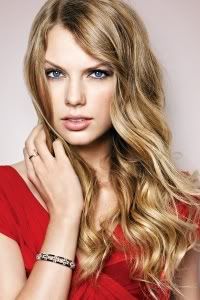
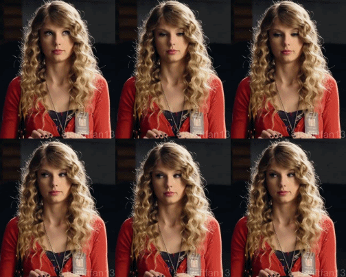
Amanda: The artistic value is in the light here - and for once, you didn't do it in Photoshop, given that little logo in the corner. You ALWAYS take those out and you didn't get to this time, which makes me bummed. Regardless, this is a gorgeous shot, but at the same time, the theme is fashion as art - I don't see the fashion here. Fashion is about the clothes, the makeup, the hair, and how all of those components work together. I don't see the clothes, and I don't see a harmonious song of elements here. I see your face illuminated by the light. It's artistic, yes, but it isn't focused on the fashion - I take most notice of your hair and that little logo. I like it, but don't love it.
Regardless, you're Taylor freaking Swift and you're definitely safe no matter what. So what I say hardly matters xD
Émilie:I like it, but at the same time, I don't. I see the art, definitely, but the fashion, not so much. The fact your face is almost completely covered by your hair really detracts from the overall modelling aspect of the photo, and you sort of look washed out. I like it, but I don't. So I'm neutral
Yoona: I like it. This is different and when I said I want something that shock us, this is exactly what I talked about. I love the fact that this time you gave us the ugly-pretty thing. Love the concept.
This week, one of you will be eliminated from the competition. It's getting tougher week by week. And personally for me, it was the toughest ranking to date. I even like the photo that I ranked last this week but I have no option and this is a competition after all.
Let's start our Judging Session now!!!

Émilie: It's nice to see something different, and unexpected from you, but "Mona Amber", maybe not quite that masterpiece. I am loving the dress and the setting, and there's a lot of story going on here, it's quite artistic too. I love that your pose is emphasising your curves, and giving you a lovely hourglass figure, and your face shows a lot of passion. I think this photo would have been taken to the next level with a little bit of neck extension.
Alex: This is super good. I like how not only the background is artistic but your artistic. The boob sticking out is a tad distracting though.
Amanda: I don't like your "Mona Amber" label. This is not at all a conservative image like the Mona Lisa was - this is over-the-top sexy, which is not exactly "artistic" unless you're talking about something that rhymes with "warn." I don't like how your dress is the same color as the wall - it makes you blend in more - and I think you've used a little too much bronzer. The boob is a bit too trashy for this to be showcased at a photographic art museum, and the painting in the background pops more than your face does. Despite that, I don't hate it - but I don't love it either.
Yoona: I love the whole concept. It's very artistic and dramatic at the same time. But I think this would look so much better in Black & White. Tone down your hoochie-ness a little bit.
Émilie: I honestly don't understand the hullabaloo about the cleavage, we know Amber's style is 50s pin up girl, but I think she does it with class, not hooch.

Émilie: I'm just going to have to face the fact that almost every photoshoot you do is artistic, because this just doesn't seem any different to some of the others. Haha. I love the styling, and the story it's telling here, and I love the emotion you're expressing. However, your legs. One of them is amazing! The other is a tree stump.
Alex: This is really good! I love it. I like your face and your outfit. It's really good.
Amanda: I'm going to have to try and judge this without seeing any of your other stuff, given your style - this is so true to you that it's almost become boring, but it's what the theme calls for. Despite it being nothing new, I love it. It fits the theme perfectly, and the two different doors sort of represent two sides - it works with the legs, Em. It really does. It's not like she can show both of them. This photo is focused, high-fashion, true to you, everything. I do like it, like I have a lot. Good work Ash - Amanda's Devils for life <3
Yoona: Gorgeous!!! The dress is amazing and I love the story in this photo. But be careful with your leg. If you stretch your legs here it would be better because you look a little bit short here. But no matter what, this is another great photo of you, Ash

Émilie: I'm sitting here, staring at this, wondering why it was chosen. I know what you have to offer, Freida, and I can think of at least two photos off the top of my head that would have been better. The artistic element is definitely there, however, it's the filter here that takes away from this. It makes you blend in. In terms of fashion, you do showcase that ugly thing well, but the problem here is your face is so blended in, it just looks like a blob with eyes and lips.
Amanda: This shot has a very high artistic value, and that's good for the theme. I personally do not mind the filter, even if it makes it a bit drab. However, I don't get a high-fashion vibe from this - it's more of an artistic photograph than showcasing fashion as art. Your monochromatic outfit is ugly, and although I like your hair, there's really nothing special about YOU here. You need to stand out more. Make yourself the art in an artistic setting like this! This is just okay - it could be so much better.
Alex: hm, i'm at lost for words. I don't really like your outfit. it's sort of ugly, but i dont blame you i blame the photographer. The good thing about the outfit it it matches the surroundings very well.
Yoona: I think I might be the only one who really love your photo this week. I think it's sensational. I love the lighting, and you connect to the camera very well. The whole concept is very unique and different. Love this photo so much

Émilie: I had to double check all your previous shoots, because I thought I'd seen this before, but the reality was a lot of your photos look like this. IE: Leaning against a wall, left hand over left shoulder, right leg up. I will give it to you that the action here is all in your face. That face is a work of art, and I love the thing on your mouth! It really adds another artistic element to it!
Amanda: The black and white robs a lot of artistic qualities here, especially because there's very little to make up for it. I also concur that we've seen this kind of shoot too much from you - you're against a blank wall, and when we want art, we don't want a plain wall. I personally hate the thing in your mouth too - I don't know what it is, and I don't see any artistic value there at all. I'm sorry Jess, but this is cause for a lot of concern this round.
Alex: I think it's very plain but i like the artistic value of it, i just which there was more. I'm a huge fan of black and white but that alone isnt enough.
Yoona: I think we all have been waiting for something different from you, Jessica. Something that will make us said "Wow". I agreed with other judges that it felt like we have seen this before. But I still think that the artistic element in this photo is very strong.

Émilie: Ah, yes. This looks like it could be a painting from the Renaissance era. I love the styling, and I LOVE your face, and I like the pose. The pose, I just like, not love, because it would've benefited an extension of your torso. But all together, I love the photo.

Amanda: This is just okay for me. It does look like you have an empty picture frame you're trying to fill here, and it does seem like a realistic piece of artwork. I like your dress, but I really don't take much notice of YOU here. I think there's too much space above your head - cropping it down a bit would have improved it a lot. It is fashionable, and it is nice to look at, but that's about it. The pose is just okay, like Em said, and it's really not as memorable as it could have been. It doesn't pop out at all. But it's still good - it just isn't great.
Yoona: The art element was there. I can see this as a paint. I still think you can do better than this. I want the energy from you. A little bit torn this week with your photo

Amanda: I've seen this shoot before. You used it last season. That fact alone robs this shoot of a lot of artistic value - it's a sort of "been there, done that" kind of deal. The black and white also doesn't work the best here - there's little to make up for it. I see your ass loud and clear, but your face is sort of an afterthought for me. Those shoes are interesting and match your hair, but that ties everything together in a way that makes this have virtually no focus. Art is focused. Art has a common theme. This does have a theme, but it just doesn't do anything for me given that you've already shown us this shoot. I expect more next round!
Émilie: Correction, Amanda, she has used from this shoot twice. Remember Haute-Couture?
We all know you have this set, but I would have thought you might use something a little softer. We've seen this hard artistic side of you many times, I was hoping for something soft to balance it out and show your versatility.
This is not a bad photo, it's just nothing new, I'll still be ranking you high.
Yoona: Yup, same problem with Jessica. Good photo but lack of "Wow" factor. I think you can do miles better than this, Rihanna. I agree with Emilie, this isn't a bad photo but we want to see your versatility.

Émilie: You always seem to surprise me, Shilpa. I didn't expect this from you at all. You are correcty. It's art because of the contrast of the dark setting, but light you, and it's fashion because of the shapes and angles you create to showcase your dress. I have no negatives about this. And your face is stunning.
Amanda: It's kind of... drab for me. I can definitely see the art here and you are really gorgeous and I like it, but at the same time, it doesn't pop out at me. The dress is fantastic, as is your face and the pose and setting, but at the same time... I just think it needs a little more color. Don't worry - you definitely won't be last, since this is a very strong photo regardless.
Yoona: I love the pose. Very strong and one thing that I impressed with you is your versatility. I think this photo would be better in larger size. So we can see how strong is your face here. But I'm really impressed with you this week, Shilpa

Amanda: The artistic value is in the light here - and for once, you didn't do it in Photoshop, given that little logo in the corner. You ALWAYS take those out and you didn't get to this time, which makes me bummed. Regardless, this is a gorgeous shot, but at the same time, the theme is fashion as art - I don't see the fashion here. Fashion is about the clothes, the makeup, the hair, and how all of those components work together. I don't see the clothes, and I don't see a harmonious song of elements here. I see your face illuminated by the light. It's artistic, yes, but it isn't focused on the fashion - I take most notice of your hair and that little logo. I like it, but don't love it.
Regardless, you're Taylor freaking Swift and you're definitely safe no matter what. So what I say hardly matters xD
Émilie:I like it, but at the same time, I don't. I see the art, definitely, but the fashion, not so much. The fact your face is almost completely covered by your hair really detracts from the overall modelling aspect of the photo, and you sort of look washed out. I like it, but I don't. So I'm neutral
Yoona: I like it. This is different and when I said I want something that shock us, this is exactly what I talked about. I love the fact that this time you gave us the ugly-pretty thing. Love the concept.

 . You're amazing in your ow way. Great to have you again and hopefully I get to see you again.







 and i'm sorry if it pissed you off.