Post by Yoona Im on Dec 18, 2011 21:56:04 GMT -5
Hello Girls!!!
Welcome to your Fifth Judging Session. This week, another girl will have to join the eliminated girls in the Sequester House. Who will it be?
Let's start our Judging Session now!!!
Team Mode
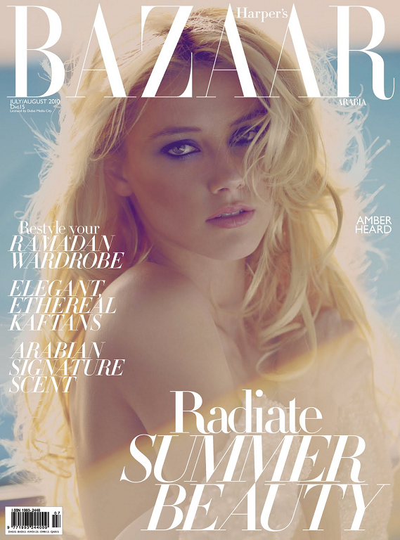
Émilie: The cover has two adjectives for this photo on it itself: elegant and ethereal. You're very beautiful, and this accentuates your facial beauty, and makes it a great beauty shot.
Amanda: The effects are almost a bit too much, but that doesn't change that you're gorgeous here and it's definitely a different side of you - exactly what we wanted to see. It's a strong, memorable cover that stands out for doing something different, even if that something different is almost a bit too overwhelming and camouflaging. Well done!
Emma: I quite like this! I do think you'd have benefited from lightening the photo, because it's really quite dark when contrasted with the lettering, but everything else about it is absolutely breathtaking. Amazing job!
Yoona: I think you look so soft here and very gorgeous. I think the effect is necessary since theme here is "Radiate Summer Beauty" Good job, Amber
Alex: This is such a great photo. You look like a princess and is one of my fav from your shoots.

Emma: I like this more than anything else you've submitted all game. It's strong, it's elegant, your makeup looks phenomenal, and it all comes together quite nicely. It's a somewhat generic shot, but there's enough difference there to keep it from being boring, which is a fine line to walk. Nicely done.
Émilie: Oohh! I like this! It's classy and elegant, even though it's minimalistic, There's still a lot to look at! Great shot!
Yoona: It feels empty actually. I love simplicity but you need to make sure that your attitude already enough to carry you. But the face here is really unique. I'm a fan of Natalie Portman. And I got her every Vogue cover. I wish you would have done one of them
Amanda: This is sort of plain, but I do love your confidence. It's strong, but it doesn't pique my curiosity. You should be safe since this is very model and elegant but it still isn't as good as last week. Still good!
Alex: I'm used to seeing plan magazine shoots... i mean you can only do so much because words surround you. But i like it. it's nice.

Émilie: This photo is sort of resting in pretty here. I mean you're very pretty, but still that's all that's going for you here.
Amanda: This is very typical, and very safe. You look gorgeous, but it's just a magazine on a pile of others with pretty girls on the cover. It isn't one that's going to be remembered. It's also a bit too pink for my liking, and that can strain the eyes a bit. It could be better, but it isn't awful or anything!
Emma: Yes, I agree that this isn't anything to write home about. However, I will point out that even in a fairly "default" shot, you still look absolutely fantastic. The pose is very sexy, and everything except the facial expression is pretty good - the face, however, is fairly generic. Still, not bad at all.
Yoona: You really have such a gorgeous face. Not a fan of your pose but your face here is quite strong and the styling was just okay to me. Wish you would stand, so that we can see your dress more
Alex: Another Pink one! I think it's pretty simple but your expression is cute.

Amanda: I love you.
Reasons why:
1) You're referencing your fierce cover as Dakota from the styling and shape of the V, and that's awesome
2) "Brett and Lex kill people" made me LOL hard, as did the "list of logos" and just everything in general
3) This is absolutely fierce and sexy. If you didn't make it obvious, I wouldn't have been able to tell that it was self-made.
You're again proving why you are one of my favorites. Amazing job
Émilie: Sweet Jesus! This is amazing! You look amazing! No negatives.
Overall, I'm very impressed that we've had a good week this week.
Emma: I disagree with your words. You already DID become America's Next Top Model. Maybe the magazine is old, or something. Anyway, very good, and all the more props for having made it yourself.
Taylor: I really love this Taylor. Some of the quote in the magazine was just too weird like "Brett & Lex Kill People"? I hope those 2 will be jailed. But I think this is very creative, dark and beautiful. Dakota submitted the Cover from V too but she went MIA after that (Killed by Brett & Lex?) I hope it's not going to happen to you. Great week for you
Alex: This reminds me of my girl Dakota from a few seasons ago. I really like it. I just wish you were looking at us.
Team Flore

Émilie: I'm afraid your doe eyes aren't working well for me here, but at least there's an aspect of intensity in them, so you're not a deer in headlights. It's a beautiful shot, but it's personally not working for me.
Amanda: I can look like that, too you know. Those eyes are fierce, but them aside, you almost look a bit older here - the contours in your face show signs of age as does the lighting with your hair, and that alone may cost you points. Still, it's a strong cover, and was pretty much what I expected you to post. GO AMANDA'S DEVILS <3
Emma: I'm ambivalent on this. I think it's a reasonably good photograph, but it's a bit too generic for my tastes. The facial expression is good, but there's nothing about it that really pops for me. It's not actually bad, or anything, I just don't really find it amazing.
Yoona: I think your eyes is beautiful but the overall look doesn't really impress me. I think you can do better than this. Your styling here is quite boring. You should be "more than just a pretty face".
Alex: This photo is very nice and elegant and i think you did a very awesome job. I love the eyes and how old you look. very mature.

Yoona: Unfortunately, your second cover wasn't as great as the "first one". But it is still great. The styling is good but the color here which is All-Black is very boring for me. The necklace is great though. I think the pose is okay.
Amanda: Okay then. This is good. Sexy, but at the same time typical. It seems to be a plainer version of your cover in Cycle Six, and it is by no means as memorable. If I had seen this one while I was at the Incheon airport, I wouldn't remember it by the time I got back to the States. I am not at all curious about this, due to the styling, but it is sexy enough to keep you standing. Why did I just repeat myself?
Alex:,I really liked the second cover over the first, so i'm glad. I love your facial expression, it's very fierce.
Émilie: You look really fierce in that cover, and your face is quite intense, but I do agree that it's a little plain.

Émilie: Look at the intensity In those eyes! I love the dress and the styling. It makes a really great cover. Great job!
Amanda: I'm a bit distracted by the thought of "I had sex every day for a month" and wondering how the hell that ended up on a magazine cover. I do like your hair and eyes, but it's still a bit plain and uninspiring - and the dress is almost a bit too much given the heart loop. That sort of drifts the attention off of your face, and without it I think it would be stronger since your face would steal the show. As it is right now... it doesn't.
Emma: I dunno, Amanda. I think if you had sex every day for a month you'd brag, too.
I like this one quite a bit. I think the pose is powerful, and facial expression is very strong. The outfit is also stunning, and the accessories really work well with it. Great job!
Yoona: LoL.. I saw that too. I was like "Poor that girllll". The pose is great and I love the styling here and the outfit looks great on you. I love the hairstyles. That's so going to be my Christmas Hairstyle this year. Thank you Kate for give me the idea for my hairstyles and gave us hope that "Sex every day in a month" is possible
Alex: Since your season i've been waiting for you to give something that rocked and this is it. I love all the pink but it may be a tad over done but still... and i just overall like this photo.

Émilie: YES! This is what I wanted to see from you. Nothing else to say but I think this is perfect. Great job.
Amanda: I don't like it as much as Emilie does, but given how few magazines you've been on, this is undoubtedly one of the best you have. It's sexy, but your face is weak and the quality is off. Still, it's good enough to keep you going, so good job!
Emma: This is a great shot. It's fresh and unique, and I really like the outfit and the pose. The facial expression could be a little less bleh, but other than that it's delightful.
Yoona: I really like your face here. I think your pose is very great. I love the confidence in this shoot. Very sexy and flirty. I really love this, girl
Alex: This is great but the quality isnt very good here... but still i like it. The pose and the outfit is my favorite.
Team Beautiqe

Émilie: This is unfortunately a very plain shot for me, though you look beautiful, there isn't really anything in particular to make it really stand out for me.
Amanda: The layout is definitely something different - although the right side has been cropped poorly, which makes the cover incomplete. Despite the different layout, there are a few things that rob this from being good: your face is really plain, your outfit is a bit messy and sort of takes the focus off your face, your hair covers one of your eyes and that doesn't really work here, and it's just way too typical and nothing really unique or special. I do like the shininess of your hair since it fits, but that's about it. This is just another plain cover.
Emma: I'm a bit iffy on the facial expression. It's got traces of fierceness, but it borders on plain to the point where I can't tell if you're owning it or just want to get the photoshoot over with so you can go home. The poor cropping is also somewhat unflattering, but I like the outfit a lot, and the hair is amazing, so it's not terrible by any means.
Yoona: The pose is strong and confident but my issue here is with your face. I think it's lack of energy. I want more attitude from you, Freida. Another concern is your cover was so badly cropped.
Alex: I like the facial expression... it makes you seem confidant in yourself. The outfit is beautiful and i think you did a great job!

Emma: I'm not a huge fan of this. You look kind of bored, and you're not making eye contact, which is really quite disappointing. Still, the pose is good, and the outfit ties into the theme well, so it's not bad.
Émilie: I personally like it. I find it very dreamy and serene. Like a cool summer morning. The pose is a tiny bit off in the fact you're an amputee here. Just watch those arms. Sometimes you can be amputated, other times we need to see that missing limb: hopefully still attached to you.
Amanda: This is good, but not stellar. I'm not fond of the "SUMMER" plastered across your chest, and it's kind of boring. I agree with Emilie that the pose is awkward too. I love the setting and your face is still decent, but overall it's not enough to make a huge impression on me. It's still way better than last week, though!
Yoona: This is much better than your last two shoot. I agree with Emilie, the setting, and the overall theme is quite interesting. And I love the styling, especially the outfit. But I noticed, this recent weeks, you tend to give us an "ugly" face. You need to work on your face expression more
Alex: This is very plain But i like your facial expression and the outfit fits the theme of the magazine... great job!
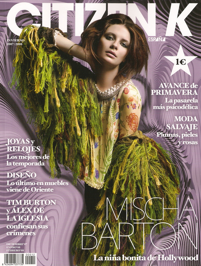
Émilie: Amazing. Absolutely amazing! This is so high fashion! It just pops right out of the page! No negatives here
Amanda: This may be high fashion, but you look like a Scooby-Doo sea monster with some ape-like qualities. The hair makes it even scarier. This is just a bit too much, and that makes it unappealing for me. Sorry
Emma: I'm trying to decide how I feel about this. While I like avant garde, I think it's a little too much like a ghillie suit to really be attractive, and it really detracts from the rest of it. I really like the pose, and the facial expression and makeup are quite good, but the outfit is really hard to get past...
Yoona: Oh my God, I have to agree with Amanda. This is way too High Fashion I guess. The cover really weird and too messy. I just can't at the outfit.
Alex: Yeah i'm not a fan of this photo... i'm going to agree with Amanda and Yoona.

Émilie: I find the smile almost scary in combination with the hairstyle. You're also a bit of a no neck monster here. Regardless, it's still a good cover, but not necessarily one I personally would buy.
Amanda: The hair is too much for me, and the pose is a bit strange given how you camouflage your neck and that it looks uncomfortable. And your eyes are almost angry... I don't really like this TOO much, but it isn't horrible or anything.
Emma: I actually quite like this, because I find the pose very dynamic and glamorous. The smile is baby-eatingly disconcerting, but that's not the first time I've had that opinion of people this cycle, and anyway the rest of it is fresh enough to make me give it a bye. Nice work!
Yoona: I love the hair and the pose. I think the styling is great too. But you know I have to agree with the no neck thing. But your energy here is so vibrant and colorful. I like this photo.
Alex: Yeah i'm going to agree it's a little too much. I mean it's cute with with words sometimes too much is well too much.
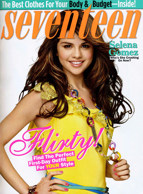
Émilie: I like this Selena, not love, but just like. It hasn't quite the energy I'd expect from a commercial cover. You look very pretty, and approachable, and that's a great thing, because that's what is going to get that magazine sold.
Amanda: I really like your smile here, you're so young and fresh. But that aside, this is kind of plain. It fits into a pile of countless similar magazines with a pretty girl on the cover. I love the pose and you are pretty and sweet, but it's not as good as the one you posted last season. There just isn't enough memorable about this, but you should be safe.
Emma: It's cute and sweet, but it's a bit too generic for me. There isn't really anything wrong here, but it's something that's a bit too simplistic about it to really make it amazing. Still, there's nothing wrong, and I wouldn't worry about your chances. Nice work!
Yoona: Too safe for me. I know you can do better than this. I'm not going to say this is a bad cover, but this cover might not give you the good callout. However, your styling is very appropriate for your age.
Alex: I love how your representing the younger generation here and that's what you are totally doing with this photo. Flirty, not so much but still a great shoot.
Welcome to your Fifth Judging Session. This week, another girl will have to join the eliminated girls in the Sequester House. Who will it be?
Let's start our Judging Session now!!!
Team Mode

Émilie: The cover has two adjectives for this photo on it itself: elegant and ethereal. You're very beautiful, and this accentuates your facial beauty, and makes it a great beauty shot.
Amanda: The effects are almost a bit too much, but that doesn't change that you're gorgeous here and it's definitely a different side of you - exactly what we wanted to see. It's a strong, memorable cover that stands out for doing something different, even if that something different is almost a bit too overwhelming and camouflaging. Well done!
Emma: I quite like this! I do think you'd have benefited from lightening the photo, because it's really quite dark when contrasted with the lettering, but everything else about it is absolutely breathtaking. Amazing job!
Yoona: I think you look so soft here and very gorgeous. I think the effect is necessary since theme here is "Radiate Summer Beauty" Good job, Amber
Alex: This is such a great photo. You look like a princess and is one of my fav from your shoots.

Emma: I like this more than anything else you've submitted all game. It's strong, it's elegant, your makeup looks phenomenal, and it all comes together quite nicely. It's a somewhat generic shot, but there's enough difference there to keep it from being boring, which is a fine line to walk. Nicely done.
Émilie: Oohh! I like this! It's classy and elegant, even though it's minimalistic, There's still a lot to look at! Great shot!
Yoona: It feels empty actually. I love simplicity but you need to make sure that your attitude already enough to carry you. But the face here is really unique. I'm a fan of Natalie Portman. And I got her every Vogue cover. I wish you would have done one of them
Amanda: This is sort of plain, but I do love your confidence. It's strong, but it doesn't pique my curiosity. You should be safe since this is very model and elegant but it still isn't as good as last week. Still good!

Alex: I'm used to seeing plan magazine shoots... i mean you can only do so much because words surround you. But i like it. it's nice.

Émilie: This photo is sort of resting in pretty here. I mean you're very pretty, but still that's all that's going for you here.
Amanda: This is very typical, and very safe. You look gorgeous, but it's just a magazine on a pile of others with pretty girls on the cover. It isn't one that's going to be remembered. It's also a bit too pink for my liking, and that can strain the eyes a bit. It could be better, but it isn't awful or anything!
Emma: Yes, I agree that this isn't anything to write home about. However, I will point out that even in a fairly "default" shot, you still look absolutely fantastic. The pose is very sexy, and everything except the facial expression is pretty good - the face, however, is fairly generic. Still, not bad at all.
Yoona: You really have such a gorgeous face. Not a fan of your pose but your face here is quite strong and the styling was just okay to me. Wish you would stand, so that we can see your dress more
Alex: Another Pink one! I think it's pretty simple but your expression is cute.

Amanda: I love you.
Reasons why:
1) You're referencing your fierce cover as Dakota from the styling and shape of the V, and that's awesome
2) "Brett and Lex kill people" made me LOL hard, as did the "list of logos" and just everything in general
3) This is absolutely fierce and sexy. If you didn't make it obvious, I wouldn't have been able to tell that it was self-made.
You're again proving why you are one of my favorites. Amazing job

Émilie: Sweet Jesus! This is amazing! You look amazing! No negatives.
Overall, I'm very impressed that we've had a good week this week.
Emma: I disagree with your words. You already DID become America's Next Top Model. Maybe the magazine is old, or something. Anyway, very good, and all the more props for having made it yourself.
Taylor: I really love this Taylor. Some of the quote in the magazine was just too weird like "Brett & Lex Kill People"? I hope those 2 will be jailed. But I think this is very creative, dark and beautiful. Dakota submitted the Cover from V too but she went MIA after that (Killed by Brett & Lex?) I hope it's not going to happen to you. Great week for you
Alex: This reminds me of my girl Dakota from a few seasons ago. I really like it. I just wish you were looking at us.
Team Flore

Émilie: I'm afraid your doe eyes aren't working well for me here, but at least there's an aspect of intensity in them, so you're not a deer in headlights. It's a beautiful shot, but it's personally not working for me.
Amanda: I can look like that, too you know. Those eyes are fierce, but them aside, you almost look a bit older here - the contours in your face show signs of age as does the lighting with your hair, and that alone may cost you points. Still, it's a strong cover, and was pretty much what I expected you to post. GO AMANDA'S DEVILS <3
Emma: I'm ambivalent on this. I think it's a reasonably good photograph, but it's a bit too generic for my tastes. The facial expression is good, but there's nothing about it that really pops for me. It's not actually bad, or anything, I just don't really find it amazing.
Yoona: I think your eyes is beautiful but the overall look doesn't really impress me. I think you can do better than this. Your styling here is quite boring. You should be "more than just a pretty face".
Alex: This photo is very nice and elegant and i think you did a very awesome job. I love the eyes and how old you look. very mature.

Yoona: Unfortunately, your second cover wasn't as great as the "first one". But it is still great. The styling is good but the color here which is All-Black is very boring for me. The necklace is great though. I think the pose is okay.
Amanda: Okay then. This is good. Sexy, but at the same time typical. It seems to be a plainer version of your cover in Cycle Six, and it is by no means as memorable. If I had seen this one while I was at the Incheon airport, I wouldn't remember it by the time I got back to the States. I am not at all curious about this, due to the styling, but it is sexy enough to keep you standing. Why did I just repeat myself?
Alex:,I really liked the second cover over the first, so i'm glad. I love your facial expression, it's very fierce.
Émilie: You look really fierce in that cover, and your face is quite intense, but I do agree that it's a little plain.

Émilie: Look at the intensity In those eyes! I love the dress and the styling. It makes a really great cover. Great job!
Amanda: I'm a bit distracted by the thought of "I had sex every day for a month" and wondering how the hell that ended up on a magazine cover. I do like your hair and eyes, but it's still a bit plain and uninspiring - and the dress is almost a bit too much given the heart loop. That sort of drifts the attention off of your face, and without it I think it would be stronger since your face would steal the show. As it is right now... it doesn't.
Emma: I dunno, Amanda. I think if you had sex every day for a month you'd brag, too.
I like this one quite a bit. I think the pose is powerful, and facial expression is very strong. The outfit is also stunning, and the accessories really work well with it. Great job!
Yoona: LoL.. I saw that too. I was like "Poor that girllll". The pose is great and I love the styling here and the outfit looks great on you. I love the hairstyles. That's so going to be my Christmas Hairstyle this year. Thank you Kate for give me the idea for my hairstyles and gave us hope that "Sex every day in a month" is possible
Alex: Since your season i've been waiting for you to give something that rocked and this is it. I love all the pink but it may be a tad over done but still... and i just overall like this photo.

Émilie: YES! This is what I wanted to see from you. Nothing else to say but I think this is perfect. Great job.
Amanda: I don't like it as much as Emilie does, but given how few magazines you've been on, this is undoubtedly one of the best you have. It's sexy, but your face is weak and the quality is off. Still, it's good enough to keep you going, so good job!
Emma: This is a great shot. It's fresh and unique, and I really like the outfit and the pose. The facial expression could be a little less bleh, but other than that it's delightful.
Yoona: I really like your face here. I think your pose is very great. I love the confidence in this shoot. Very sexy and flirty. I really love this, girl
Alex: This is great but the quality isnt very good here... but still i like it. The pose and the outfit is my favorite.
Team Beautiqe

Émilie: This is unfortunately a very plain shot for me, though you look beautiful, there isn't really anything in particular to make it really stand out for me.
Amanda: The layout is definitely something different - although the right side has been cropped poorly, which makes the cover incomplete. Despite the different layout, there are a few things that rob this from being good: your face is really plain, your outfit is a bit messy and sort of takes the focus off your face, your hair covers one of your eyes and that doesn't really work here, and it's just way too typical and nothing really unique or special. I do like the shininess of your hair since it fits, but that's about it. This is just another plain cover.
Emma: I'm a bit iffy on the facial expression. It's got traces of fierceness, but it borders on plain to the point where I can't tell if you're owning it or just want to get the photoshoot over with so you can go home. The poor cropping is also somewhat unflattering, but I like the outfit a lot, and the hair is amazing, so it's not terrible by any means.
Yoona: The pose is strong and confident but my issue here is with your face. I think it's lack of energy. I want more attitude from you, Freida. Another concern is your cover was so badly cropped.
Alex: I like the facial expression... it makes you seem confidant in yourself. The outfit is beautiful and i think you did a great job!

Emma: I'm not a huge fan of this. You look kind of bored, and you're not making eye contact, which is really quite disappointing. Still, the pose is good, and the outfit ties into the theme well, so it's not bad.
Émilie: I personally like it. I find it very dreamy and serene. Like a cool summer morning. The pose is a tiny bit off in the fact you're an amputee here. Just watch those arms. Sometimes you can be amputated, other times we need to see that missing limb: hopefully still attached to you.
Amanda: This is good, but not stellar. I'm not fond of the "SUMMER" plastered across your chest, and it's kind of boring. I agree with Emilie that the pose is awkward too. I love the setting and your face is still decent, but overall it's not enough to make a huge impression on me. It's still way better than last week, though!
Yoona: This is much better than your last two shoot. I agree with Emilie, the setting, and the overall theme is quite interesting. And I love the styling, especially the outfit. But I noticed, this recent weeks, you tend to give us an "ugly" face. You need to work on your face expression more
Alex: This is very plain But i like your facial expression and the outfit fits the theme of the magazine... great job!

Émilie: Amazing. Absolutely amazing! This is so high fashion! It just pops right out of the page! No negatives here
Amanda: This may be high fashion, but you look like a Scooby-Doo sea monster with some ape-like qualities. The hair makes it even scarier. This is just a bit too much, and that makes it unappealing for me. Sorry

Emma: I'm trying to decide how I feel about this. While I like avant garde, I think it's a little too much like a ghillie suit to really be attractive, and it really detracts from the rest of it. I really like the pose, and the facial expression and makeup are quite good, but the outfit is really hard to get past...
Yoona: Oh my God, I have to agree with Amanda. This is way too High Fashion I guess. The cover really weird and too messy. I just can't at the outfit.
Alex: Yeah i'm not a fan of this photo... i'm going to agree with Amanda and Yoona.

Émilie: I find the smile almost scary in combination with the hairstyle. You're also a bit of a no neck monster here. Regardless, it's still a good cover, but not necessarily one I personally would buy.
Amanda: The hair is too much for me, and the pose is a bit strange given how you camouflage your neck and that it looks uncomfortable. And your eyes are almost angry... I don't really like this TOO much, but it isn't horrible or anything.
Emma: I actually quite like this, because I find the pose very dynamic and glamorous. The smile is baby-eatingly disconcerting, but that's not the first time I've had that opinion of people this cycle, and anyway the rest of it is fresh enough to make me give it a bye. Nice work!
Yoona: I love the hair and the pose. I think the styling is great too. But you know I have to agree with the no neck thing. But your energy here is so vibrant and colorful. I like this photo.
Alex: Yeah i'm going to agree it's a little too much. I mean it's cute with with words sometimes too much is well too much.

Émilie: I like this Selena, not love, but just like. It hasn't quite the energy I'd expect from a commercial cover. You look very pretty, and approachable, and that's a great thing, because that's what is going to get that magazine sold.
Amanda: I really like your smile here, you're so young and fresh. But that aside, this is kind of plain. It fits into a pile of countless similar magazines with a pretty girl on the cover. I love the pose and you are pretty and sweet, but it's not as good as the one you posted last season. There just isn't enough memorable about this, but you should be safe.
Emma: It's cute and sweet, but it's a bit too generic for me. There isn't really anything wrong here, but it's something that's a bit too simplistic about it to really make it amazing. Still, there's nothing wrong, and I wouldn't worry about your chances. Nice work!
Yoona: Too safe for me. I know you can do better than this. I'm not going to say this is a bad cover, but this cover might not give you the good callout. However, your styling is very appropriate for your age.
Alex: I love how your representing the younger generation here and that's what you are totally doing with this photo. Flirty, not so much but still a great shoot.

