Post by Yoona Im on Jan 4, 2012 10:26:38 GMT -5
Hello Final 10!!!
This week we are going to say goodbye to not one but two models. Two models with the lowest score will be eliminated. This week, for the first time, you were no longer compete in team. No teammates can help you now.
Let's start our judging session!!!

Amanda: This is the kind of vintage effect Adele would use. She's a very old-fashioned singer, and this photo's effect reflects that well. It's also a good relation to the theme of the song, with heartbreak on the mind but a somewhat healthy one - it's coping. One gripe I do have is the pose - the hands on the chest seem weird and sort of rob the photo of some intimacy, and your expression and the angle of your face leave a little to desire. It's still way better than last week, so good work
Émilie: I certainly see the deep pensive state, and yes, it's very old fashioned, similar to Adele's personal style. I agree with Amanda, the pose is obvious, but I think it needs something a bit more. I'd love for it to be a full body shot of some sort. It feels like only your face is modelling here.
Emma: I think this pose fits the tone of the song really well. "Rolling in the Deep" is a pretty mournful song, and you definitely convey that really well. The pose is a touch awkward to me, but the makeup, facial expression, and setting really drive your point home. Excellent work!
Alex: Just like the song hits the heart by telling a story, this photo hits the heart by telling a story. I cant find anything I dont like in this!
Yoona: Welcome Back, Amber. After disappointing photos for last few weeks, you're back stronger. I felt the emotion that you portray in this photo.

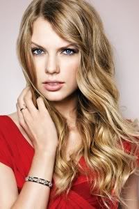
Amanda: I can see the "alien" vibe here - that and you do look like Katy Perry (only blonde). It's freaky like the song, yet still stunning and modelesque - I love it, but there is the issue of the heart shape on the shirt. This isn't a love song, so that sort of seems awkward, but then again, this is Katy Perry we are talking about. What ISN'T awkward about that girl? Great work
Émilie: Actually, Amanda, this is a love song. Well, a lust song. It's about how Katy finds this guy mesmerising. But the heart could also work, because she's an Alien. Alien's might have hearts on the outside, right?
But I digress, I love this. You look spooky, out of this world, extraterrestrial. Your face is magic here, and I love the extension in your neck. Even though hair unpleasantly covers your face, I think you're making it work.
Emma: This does have a pretty alien, sci-fi-ey look to it, but I'm not a huge fan of it. For starters, it actually doesn't look like you to the point where I actually went and did a search to verify that it even was. I'm really not a fan of the whiteness in this photo, but I actually quite like what it does to your face, and the outfit is also quite nice, so overall it's still pretty good.
Alex: I can totally see this being a cover for this song. I like how this is something different that i've seen from you.
Yoona: Yup. You looked so different and interesting. Wow. I'm really impressed by you girl. I love the styling. I think the expression is strong.

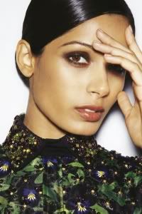
Émilie: Last Friday night you... Did a pin up photoshoot? A description would have been nice. I see nothing pertaining to that song here. I'm not sure how to judge this, frankly.
Amanda: We went streaking in the park, skinnydipping in the dark... not pinupping on top of cookie monster. Although I do get a Katy Perry vibe given the colors and flamboyancy, I don't get the relation to the song, either. That song is about HARDCORE partying - getting drunk at Rebecca Black's house and not remembering the night prior until you get on Facebook. The dress is too short, the long legs are stunning, but at the same time... this is almost too trashy and risque. I'm really not sure what to think of this either...... and it's never a good thing when you've left not one but two judges flabbergasted.
Emma: I almost kind of understand it. I think that the idea is that this is a shot you'd take in the midst of an insanely drunken party, or something. Or, if I go all H-core English major on it, she's getting all metaphysical on us, and the idea is that we're so confused by this, that it's actually exactly like how confused Katy Perry is in the song. Huh? HUH?
Anyway, moving on to my other main skill (judging a photo's aesthetics without really caring about theme relation), the legs here are simply bombastic, and you showcase them amazingly well. The pose is actually not nearly as awkward as it looks, and the outfit is cute and vintage. The facial expression is also quite good, and I like the hair. So if you don't count the theme debacle, it's actually a really great effort. But we do have to count that, kind of, so it's going to be a bit unpredictable, I'm afraid...
Alex: I can see this going with the song. The song is all about having fun and going crazy! and this photo is fun and crazy. I like it!
Yoona: I think you're having so much fun here. It was nice to see you get loose a little bit. This is the fun side of Freida that I still didn't see. I love you legs.. And the styling is amazing
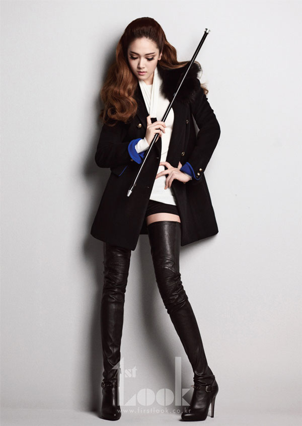
Amanda: That's not my kind of song, to be honest, so thank you for the explanation. The outfit is very strong, and your hair is too - but I really, really do NOT like your face and the way you're looking down. It seems like you're almost taking a bow to your master, rather than being the boss yourself. It's that awkwardness that harms the photo considerably - although the outfit and staging are fantastic, there's not enough in your presence for this to be a perfect fit. It's still good, don't get me wrong, but it's too awkward.
Émilie: This song is a very theatrical song. I get the ringmaster theme, sadism and masochism is all about master and slave. A ring master is the master of the circus. S&M is very much like a very, scary circus to me, so I get it.
I think this photo would've been a lot better with connection to the camera, and an aggressive face.
Emma: Personally, I see it a lot more as a "I'm looking down at you in an 'Aww, you're my little slave'" kind of evil way. (I don't even have a better explanation for it than that, but if you've ever seen the anime Blood+ it's exactly the way Diva looks at her minions.) I think you did really well at not getting too trashy with this, Jessica, and that's a really tough thing to do with a song like this. I like the pose, I like the accessories and the outfit, and overall it's a great shot. Well done!
Yoona: I think the styling is great. But my problem is with your face. I want it to be more stronger. Remember, you're the dominator here. You look a little bit soft and nice here.
Alex: I agree with Yoona this would be perfect if your face was harder.

Émilie: This is cute, but there's nothing really that interesting here in terms of modelling. Theatrically, it's good, but in modelling, it's so very boring. Yes, it shows connection, and relates to the theme, but... We're looking for a model
Yoona: Yup Mischa, I think this week photo is lacking in sense of fashion. The angle didn't really help you here. Those two cute bulldogs kinda overshadowed you and your partner this week.
Amanda: Not to be punny or anything, but this is bull. The dogs and your partner catch my eye long before you do. Your face is to the side and covered by your hair... your outfit isn't high-fashion and is overall quite weak, especially that shirt - it's candid, or possibly a screenshot. I also see no chemistry whatsoever between you two, no energy. It seems like a forced kind of "love" and that hurts a lot. I really can't find anything redeeming about this, except that it's sort of cute even though I hate dogs. That aside... I'm sorry, but you'd better hope two people blow it worse than you do since no team can save you now.
Emma: Sadly, we don't really get a good sense of you in this picture, which is too bad, because I think you had a very good idea of where to go with this theme. Not really a huge fan of the pose, but I like the idea and execution, and the outfit is pretty cute, so overall it's still rather positive, for me...
Alex: The dogs seem to b more in focus then you are. I'm just not loving it this week.

Amanda: I can totally see how it relates to this song - I don't know this song even though I DO like Maroon 5 and Christina - but at the same time, this photo gives me no interest in listening to it. I don't see you "owning who you are" - I see you being left out in the cold. The face isn't at all confident, and that's what your description says it should be. I see this more as fear than sexy. I don't feel the pose, even if it does relate to the song - but would Jagger be left in the cold?
Émilie: Yes, this song is about flaunting your sexiness, and owning it. You are flaunting your sexiness, but you are not owning it. Well everything in this picture is owning it, except your eyes. Your actual eyes, yes, it's sexy, but there's nothing to show us that you are owning it. Perhaps a bit of a "smize" and we would've been blown away.
Emma: Seriously, you guys? I see the smoulder of ownage here. In fact, I like that term so much that I'm going to call it Smownage. From now on I expect you all to use it. And to credit me with its creation.
But enough about me. I think this is a very good shot. The pose is good, the Smownage is off the charts, and the accessories really tie into it well. My main gripe is with the coloring of the shot, as the dullness of it kind of detracts from you, but in the grand scheme of things that's only a minor quibble. Nice work!
Yoona: I loves this photo too. I think you look very sexy and I love the fact that you being flirty here. I don't think we ever saw this side of you. I love the styling. Sexy but you not over do it.

Émilie: The one eye thing is Rihanna's thing. As long as you work it, and you work double time for that eye, it should be okay. Frankly, this is what I looked like three days ago, for the same reason as Adele. I think you emote this really well. Your expression is sort of self loathing "what have I done?" what I think brings this down a bit are your legs, they sort of look like someone else's.
Emma: It's a pretty strong shot, all the way around. Your facial expression and outfit really convey the theme nicely, and the black and white actually helps the overall impression quite a bit. Nice work!
Yoona: I'm loving it. I think the emotion was there. I can feel that you try to come back from a bad relationship and try to be positive as much as you can. I think there's a hope from your eye.
Amanda: This is a very gorgeous photo. I love the intensity of your face and your hair too - I like the black a lot more than the red. The one gripe I have here is that I can only somewhat see the relation to the song. You aren't crying exactly - you're more worried, and thinking, but still somewhat content, wondering. If that makes sense. Hold on, let me listen to the song... I've only heard it twice...
Okay this fits perfectly. Plus, the black and white helps, given that 1) it's Adele and she likes vintage stuff, and 2) it works with the emotions of the photo. Great work!
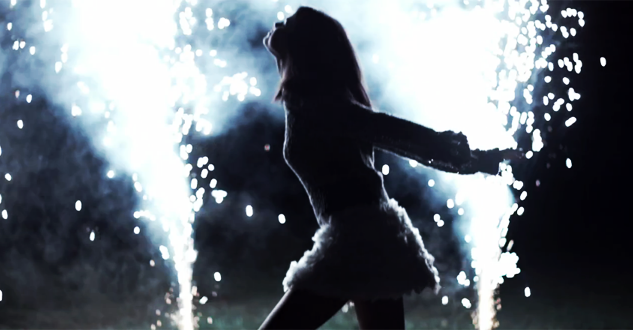
Émilie: As an artistic modelling piece, I like it. As a fashion modelling piece, I don't. There's nothing to judge. I think you shot yourself in the foot, frankly. This is not how a risk works, I think you took the song too literally.
Amanda: I'm really sorry, Selena. You know I'm a fan of yours, but given this photo, it's highly likely that you're going to be eliminated this week. I concur with Emilie - you took the song too literally and showed off fireworks and not yourself. For this song, we want you to be a burning ball of energy, bursting with love, lighting up the flames in Justin Bieber's heart. This is not at all the right direction for you - we can't see ANY of you, just a shadow. What if this wasn't even you? We can't even tell! The focus is on the background, not you. Sorry, but you're gone unless a miracle happens
Emma: Eh, there isn't much I can say that hasn't been said already. Sadly, risks don't always pan out for the best, and I think that's the case here. It's a bit blurry, and we don't really see you at all. I think you definitely got a lot of the theme nailed, but other than that it just doesn't work as a modelling shot.
Yoona: Selena... I'm not sure about this but I love the fact that this photo looks artistic but I wish we get to see more of your face. Very risky. Some people might get this photo but other people might didn't get it at all.
Alex: Selena, i'm going to be that judge. I love this photo! It's actually one of my favorites and it's the first one i looked at and could guess the song without even reading the titles.

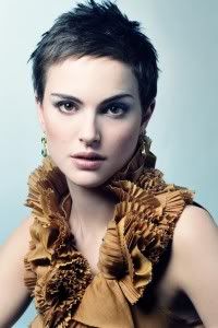
Amanda: I have a pretty big issue with how zoomed-in this is. It's a bit too in-your-face for me, and that makes it really unappealing. I really hate that nose piercing, too - it's too big, and it detracts from your eyes and lips, especially given how close up it is. It's harder to see your heritage given how it's cropped, and that's a bad thing. Yes, I can see that it is Indian, but only barely - and for a focus on your heritage, it's not that demanding. I also don't see the Lady Gaga in here - you're not showing off an entire flamboyant outfit. This is just okay - I wish there was a lot more here.
Émilie: I hate this song, with an intense burning passion, more fiery than the deepest pits of hell in the middle of a hot, Australian summer, surrounded by bushfires which tear through everything in their paths.
I actually like this though, and you look proud to be Indian. Sometimes, a full shot is not necessary to capture the emotion, in this case, pride. I love the traditional styling, from the bindi and sari, to the piercing and henna. You look very happy and proud to be Indian, so I think it captures the essence of the song. You were born like that, so you should be proud of yourself.
Emma: You definitely have a great grasp of the theme, and I really felt like this particular one could go tragically wrong, so well done on that. It's a good commercial shot, and really emphasizes your cultural heritage, so overall I quite like it.
Yoona: I agree with Amanda. The zoom in issue. I wish we would see more. But you look very beautiful here. I love the styling because it really emphasis your culture. My only issue is with the close up
Alex: I agree with the zoom in

Émilie: I think this is an example of taking the name of the song literally, and it working. Your photo looks like a representation of an emotional explosion. I think your pose here is great, however, zooming in, your face isn't quite working. It's not entirely a good angle for you. We can see your brain.
Emma: Hmm, yes. It's somewhat hard to actually make you out in all of this. Though I do think you have excellent execution of the theme, it seems like you yourself are kind of lost in the middle there, and it's hard to judge based on that. I think the pose is pretty strong, but not a fan of the angle of your head. Still, it's not terrible or anything...
Yoona: I'm a little bit torn this week, Taylor. There's a part of me want to love it but I agree with Emma. You look like you're lost. And the outfit kinda overshadowed you.
Amanda: I have nothing to add, really. It's an amazing shoot with emotional explosion, and taking the song to a literal extreme and finding it a way to make it work. It works great for the song - except for the face. It's not intense enough. It doesn't fit with the rest of the photo. Still, for me that's not a major quibble, so good work
This week we are going to say goodbye to not one but two models. Two models with the lowest score will be eliminated. This week, for the first time, you were no longer compete in team. No teammates can help you now.
Let's start our judging session!!!

Amanda: This is the kind of vintage effect Adele would use. She's a very old-fashioned singer, and this photo's effect reflects that well. It's also a good relation to the theme of the song, with heartbreak on the mind but a somewhat healthy one - it's coping. One gripe I do have is the pose - the hands on the chest seem weird and sort of rob the photo of some intimacy, and your expression and the angle of your face leave a little to desire. It's still way better than last week, so good work

Émilie: I certainly see the deep pensive state, and yes, it's very old fashioned, similar to Adele's personal style. I agree with Amanda, the pose is obvious, but I think it needs something a bit more. I'd love for it to be a full body shot of some sort. It feels like only your face is modelling here.
Emma: I think this pose fits the tone of the song really well. "Rolling in the Deep" is a pretty mournful song, and you definitely convey that really well. The pose is a touch awkward to me, but the makeup, facial expression, and setting really drive your point home. Excellent work!
Alex: Just like the song hits the heart by telling a story, this photo hits the heart by telling a story. I cant find anything I dont like in this!
Yoona: Welcome Back, Amber. After disappointing photos for last few weeks, you're back stronger. I felt the emotion that you portray in this photo.

Amanda: I can see the "alien" vibe here - that and you do look like Katy Perry (only blonde). It's freaky like the song, yet still stunning and modelesque - I love it, but there is the issue of the heart shape on the shirt. This isn't a love song, so that sort of seems awkward, but then again, this is Katy Perry we are talking about. What ISN'T awkward about that girl? Great work

Émilie: Actually, Amanda, this is a love song. Well, a lust song. It's about how Katy finds this guy mesmerising. But the heart could also work, because she's an Alien. Alien's might have hearts on the outside, right?

But I digress, I love this. You look spooky, out of this world, extraterrestrial. Your face is magic here, and I love the extension in your neck. Even though hair unpleasantly covers your face, I think you're making it work.
Emma: This does have a pretty alien, sci-fi-ey look to it, but I'm not a huge fan of it. For starters, it actually doesn't look like you to the point where I actually went and did a search to verify that it even was. I'm really not a fan of the whiteness in this photo, but I actually quite like what it does to your face, and the outfit is also quite nice, so overall it's still pretty good.
Alex: I can totally see this being a cover for this song. I like how this is something different that i've seen from you.
Yoona: Yup. You looked so different and interesting. Wow. I'm really impressed by you girl. I love the styling. I think the expression is strong.

Émilie: Last Friday night you... Did a pin up photoshoot? A description would have been nice. I see nothing pertaining to that song here. I'm not sure how to judge this, frankly.
Amanda: We went streaking in the park, skinnydipping in the dark... not pinupping on top of cookie monster. Although I do get a Katy Perry vibe given the colors and flamboyancy, I don't get the relation to the song, either. That song is about HARDCORE partying - getting drunk at Rebecca Black's house and not remembering the night prior until you get on Facebook. The dress is too short, the long legs are stunning, but at the same time... this is almost too trashy and risque. I'm really not sure what to think of this either...... and it's never a good thing when you've left not one but two judges flabbergasted.
Emma: I almost kind of understand it. I think that the idea is that this is a shot you'd take in the midst of an insanely drunken party, or something. Or, if I go all H-core English major on it, she's getting all metaphysical on us, and the idea is that we're so confused by this, that it's actually exactly like how confused Katy Perry is in the song. Huh? HUH?
Anyway, moving on to my other main skill (judging a photo's aesthetics without really caring about theme relation), the legs here are simply bombastic, and you showcase them amazingly well. The pose is actually not nearly as awkward as it looks, and the outfit is cute and vintage. The facial expression is also quite good, and I like the hair. So if you don't count the theme debacle, it's actually a really great effort. But we do have to count that, kind of, so it's going to be a bit unpredictable, I'm afraid...
Alex: I can see this going with the song. The song is all about having fun and going crazy! and this photo is fun and crazy. I like it!
Yoona: I think you're having so much fun here. It was nice to see you get loose a little bit. This is the fun side of Freida that I still didn't see. I love you legs.. And the styling is amazing

Amanda: That's not my kind of song, to be honest, so thank you for the explanation. The outfit is very strong, and your hair is too - but I really, really do NOT like your face and the way you're looking down. It seems like you're almost taking a bow to your master, rather than being the boss yourself. It's that awkwardness that harms the photo considerably - although the outfit and staging are fantastic, there's not enough in your presence for this to be a perfect fit. It's still good, don't get me wrong, but it's too awkward.
Émilie: This song is a very theatrical song. I get the ringmaster theme, sadism and masochism is all about master and slave. A ring master is the master of the circus. S&M is very much like a very, scary circus to me, so I get it.
I think this photo would've been a lot better with connection to the camera, and an aggressive face.
Emma: Personally, I see it a lot more as a "I'm looking down at you in an 'Aww, you're my little slave'" kind of evil way. (I don't even have a better explanation for it than that, but if you've ever seen the anime Blood+ it's exactly the way Diva looks at her minions.) I think you did really well at not getting too trashy with this, Jessica, and that's a really tough thing to do with a song like this. I like the pose, I like the accessories and the outfit, and overall it's a great shot. Well done!
Yoona: I think the styling is great. But my problem is with your face. I want it to be more stronger. Remember, you're the dominator here. You look a little bit soft and nice here.
Alex: I agree with Yoona this would be perfect if your face was harder.

Émilie: This is cute, but there's nothing really that interesting here in terms of modelling. Theatrically, it's good, but in modelling, it's so very boring. Yes, it shows connection, and relates to the theme, but... We're looking for a model
Yoona: Yup Mischa, I think this week photo is lacking in sense of fashion. The angle didn't really help you here. Those two cute bulldogs kinda overshadowed you and your partner this week.
Amanda: Not to be punny or anything, but this is bull. The dogs and your partner catch my eye long before you do. Your face is to the side and covered by your hair... your outfit isn't high-fashion and is overall quite weak, especially that shirt - it's candid, or possibly a screenshot. I also see no chemistry whatsoever between you two, no energy. It seems like a forced kind of "love" and that hurts a lot. I really can't find anything redeeming about this, except that it's sort of cute even though I hate dogs. That aside... I'm sorry, but you'd better hope two people blow it worse than you do since no team can save you now.
Emma: Sadly, we don't really get a good sense of you in this picture, which is too bad, because I think you had a very good idea of where to go with this theme. Not really a huge fan of the pose, but I like the idea and execution, and the outfit is pretty cute, so overall it's still rather positive, for me...
Alex: The dogs seem to b more in focus then you are. I'm just not loving it this week.

Amanda: I can totally see how it relates to this song - I don't know this song even though I DO like Maroon 5 and Christina - but at the same time, this photo gives me no interest in listening to it. I don't see you "owning who you are" - I see you being left out in the cold. The face isn't at all confident, and that's what your description says it should be. I see this more as fear than sexy. I don't feel the pose, even if it does relate to the song - but would Jagger be left in the cold?
Émilie: Yes, this song is about flaunting your sexiness, and owning it. You are flaunting your sexiness, but you are not owning it. Well everything in this picture is owning it, except your eyes. Your actual eyes, yes, it's sexy, but there's nothing to show us that you are owning it. Perhaps a bit of a "smize" and we would've been blown away.
Emma: Seriously, you guys? I see the smoulder of ownage here. In fact, I like that term so much that I'm going to call it Smownage. From now on I expect you all to use it. And to credit me with its creation.
But enough about me. I think this is a very good shot. The pose is good, the Smownage is off the charts, and the accessories really tie into it well. My main gripe is with the coloring of the shot, as the dullness of it kind of detracts from you, but in the grand scheme of things that's only a minor quibble. Nice work!
Yoona: I loves this photo too. I think you look very sexy and I love the fact that you being flirty here. I don't think we ever saw this side of you. I love the styling. Sexy but you not over do it.

Émilie: The one eye thing is Rihanna's thing. As long as you work it, and you work double time for that eye, it should be okay. Frankly, this is what I looked like three days ago, for the same reason as Adele. I think you emote this really well. Your expression is sort of self loathing "what have I done?" what I think brings this down a bit are your legs, they sort of look like someone else's.
Emma: It's a pretty strong shot, all the way around. Your facial expression and outfit really convey the theme nicely, and the black and white actually helps the overall impression quite a bit. Nice work!
Yoona: I'm loving it. I think the emotion was there. I can feel that you try to come back from a bad relationship and try to be positive as much as you can. I think there's a hope from your eye.
Amanda: This is a very gorgeous photo. I love the intensity of your face and your hair too - I like the black a lot more than the red. The one gripe I have here is that I can only somewhat see the relation to the song. You aren't crying exactly - you're more worried, and thinking, but still somewhat content, wondering. If that makes sense. Hold on, let me listen to the song... I've only heard it twice...
Okay this fits perfectly. Plus, the black and white helps, given that 1) it's Adele and she likes vintage stuff, and 2) it works with the emotions of the photo. Great work!


Émilie: As an artistic modelling piece, I like it. As a fashion modelling piece, I don't. There's nothing to judge. I think you shot yourself in the foot, frankly. This is not how a risk works, I think you took the song too literally.
Amanda: I'm really sorry, Selena. You know I'm a fan of yours, but given this photo, it's highly likely that you're going to be eliminated this week. I concur with Emilie - you took the song too literally and showed off fireworks and not yourself. For this song, we want you to be a burning ball of energy, bursting with love, lighting up the flames in Justin Bieber's heart. This is not at all the right direction for you - we can't see ANY of you, just a shadow. What if this wasn't even you? We can't even tell! The focus is on the background, not you. Sorry, but you're gone unless a miracle happens

Emma: Eh, there isn't much I can say that hasn't been said already. Sadly, risks don't always pan out for the best, and I think that's the case here. It's a bit blurry, and we don't really see you at all. I think you definitely got a lot of the theme nailed, but other than that it just doesn't work as a modelling shot.
Yoona: Selena... I'm not sure about this but I love the fact that this photo looks artistic but I wish we get to see more of your face. Very risky. Some people might get this photo but other people might didn't get it at all.
Alex: Selena, i'm going to be that judge. I love this photo! It's actually one of my favorites and it's the first one i looked at and could guess the song without even reading the titles.

Amanda: I have a pretty big issue with how zoomed-in this is. It's a bit too in-your-face for me, and that makes it really unappealing. I really hate that nose piercing, too - it's too big, and it detracts from your eyes and lips, especially given how close up it is. It's harder to see your heritage given how it's cropped, and that's a bad thing. Yes, I can see that it is Indian, but only barely - and for a focus on your heritage, it's not that demanding. I also don't see the Lady Gaga in here - you're not showing off an entire flamboyant outfit. This is just okay - I wish there was a lot more here.
Émilie: I hate this song, with an intense burning passion, more fiery than the deepest pits of hell in the middle of a hot, Australian summer, surrounded by bushfires which tear through everything in their paths.
I actually like this though, and you look proud to be Indian. Sometimes, a full shot is not necessary to capture the emotion, in this case, pride. I love the traditional styling, from the bindi and sari, to the piercing and henna. You look very happy and proud to be Indian, so I think it captures the essence of the song. You were born like that, so you should be proud of yourself.
Emma: You definitely have a great grasp of the theme, and I really felt like this particular one could go tragically wrong, so well done on that. It's a good commercial shot, and really emphasizes your cultural heritage, so overall I quite like it.
Yoona: I agree with Amanda. The zoom in issue. I wish we would see more. But you look very beautiful here. I love the styling because it really emphasis your culture. My only issue is with the close up
Alex: I agree with the zoom in

Émilie: I think this is an example of taking the name of the song literally, and it working. Your photo looks like a representation of an emotional explosion. I think your pose here is great, however, zooming in, your face isn't quite working. It's not entirely a good angle for you. We can see your brain.
Emma: Hmm, yes. It's somewhat hard to actually make you out in all of this. Though I do think you have excellent execution of the theme, it seems like you yourself are kind of lost in the middle there, and it's hard to judge based on that. I think the pose is pretty strong, but not a fan of the angle of your head. Still, it's not terrible or anything...
Yoona: I'm a little bit torn this week, Taylor. There's a part of me want to love it but I agree with Emma. You look like you're lost. And the outfit kinda overshadowed you.
Amanda: I have nothing to add, really. It's an amazing shoot with emotional explosion, and taking the song to a literal extreme and finding it a way to make it work. It works great for the song - except for the face. It's not intense enough. It doesn't fit with the rest of the photo. Still, for me that's not a major quibble, so good work



 . But it was so much fun to have you again. Hopefully get to see you again, Sapphire with new celebrity. Thank you for being with us.
