|
|
Post by Shilpa Shetty on Jan 14, 2012 12:30:59 GMT -5
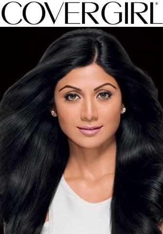
LIPSTICK  MASCARA  I chose this two photos because they both showcase the product to the best of their abilities, and I find both photos commercial but with an edge. Your Official Covergirl Ads   |
|
|
|
Post by Amanda Kimmel on Jan 14, 2012 13:19:46 GMT -5
Amanda: I hate to break it to you, but your lipstick photo is awful. It looks very Photoshopped and inauthentic, plus I don't even know if you're wearing lipstick! Your hair pops first, then your eyes... I hardly pay any attention to your lips at all. Your lips are shown much better in the second one. Sorry Shilpa, but after this shampoo ad, you're in trouble. The mascara photo looks very familiar - it was your avatar last season. I must say I quite like it for a mascara ad. I love the hair, but the effect at the bottom might be a bit too much for CoverGirl. Everything else about it is great, so it gives you some hope. Good work on this one!  |
|
|
|
Post by Emma Watson on Jan 14, 2012 13:27:45 GMT -5
Emma: I'm afraid that I'm also not a fan of the lipstick photo. The product is there, and it's by no means bad, but it doesn't really have the emphasis and centrality that we look for in a Covergirl shot. And that's really too bad, because the rest of the photo is actually quite stunning. The hair is amazing, and the facial expression is delightful, but the product placement just isn't there.
The mascara photo, however, is in an entirely different class. You showcase the product amazingly well, and you do it in a way that's non-traditional without being totally removed from the typical Covergirl style. That's a hard medium to hit, but I'd say you nailed it. Well done on this!
|
|
|
|
Post by Émilie Simon on Jan 14, 2012 19:16:19 GMT -5
Émilie: Your lipstick photo is the victim of bad photoshopping, and probably would've benefited from some cropping, and some lip colour enhancing in photoshop, especially if you found a bigger photo of it. It's not a bad photo per se, it just doesn't fill the brief. If it were a different product for covergirl, it may have worked better. Your lips do look good, but it's not the focus point here.
Your mascara photo. Every judge and their cat knows this is the photo I had wanted you to use for mascara. The mascara is the central focus, plus it's classy, sophisticated, and very non-traditional to CoverGirl, but still works, as Emma said, that's a hard thing to do.
|
|
|
|
Post by Yoona Im on Jan 15, 2012 10:51:39 GMT -5
Yoona: I actually like the lipstick one better than the mascara. I think you look fresh, very beautiful and the color of your lipstick is really good with your skin tone. I'm so tired with the lipstick ad which gave us the model with the red lipstick. Not everyone can look great with the red lipstick. I think you picked the right color for yourself. As for the mascara, it was a great photo but again no "Shock Value" for me.
|
|