Post by Yoona Im on Jan 15, 2012 22:22:35 GMT -5
Hello Final 5!!!!
This is probably the toughest week this cycle either for you models or us judges. For this week you need to come up with 2 different Covergirl Ad for 2 different products. LipPerfect LipColor & Lash Mascara. Mr. Alex couldn't be with us today. He's a little bit busy and let's hope he will be back for the Finale next week
Let's start our judging session
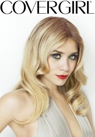
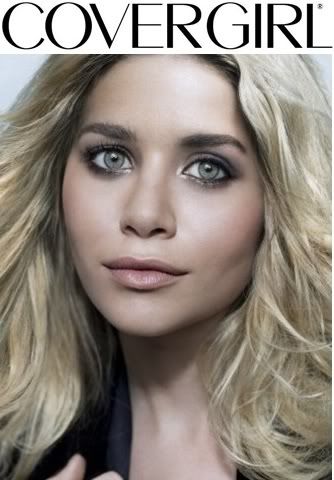
Amanda: That lipstick is sexy. You look really formal and your face steals the show. I also see the mascara in that one, but the color of the lips catches my eye immediately. Your hair is great and the outfit is fine given the cropping of the image. It's a fantastic shot all around. Great work!
The mascara photo, unfortunately, doesn't do anything for me. It's sort of plain and unmemorable, and the image seems to be a little grayish. That prevents your eyes from popping! I still am drawn to your eyes, and I know you're trying to avoid re-using an old photoshoot, but this isn't as good as some of the other things we've seen from you. I know you can do better than this.
That lipstick one is still amazing so you should be good
Emma: I quite like the lipstick one. I've been iffy on quite a number of your recent photos, because I feel like it's been the exact same facial expression every single time, but this one is different and fresh, and I like it for that reason alone, not to mention that it's just overall an amazing shot.
The mascara one, however, does tragically tend to fall once more into the "generic Ashley face" that we've seen ten trillion times in this competition. The hair is reasonably nice, and we do get a good sense of the mascara, but it does kind of drag my overall impression down pretty substantially.
Émilie: Your lipstick photo is AMAZING! It's very much what CoverGirl is aiming for nowadays, with a more high-fashion, or classy look. You look classy and sophisticated, and young women will want to buy that product because they can look classy and sophisticated too.
Your mascara one is incredibly awkward, though we do see the mascara, you look unhealthy. Your skin is not glowing. The consumer may think that this product may end up making them look unhealthy too. That's not what we want for CoverGirl.
Yoona: Wow for your lipstick photo. Very fierce and strong. I love this side of you so much. I get the energy and confident from you girl. As for your mascara, I was a little bit surprised because I expected you to do better for this one with your big eyes. A little bit gloomy for a Covergirl shoot


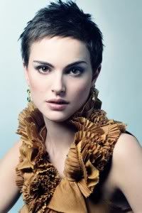
Yoona: I love your look in the mascara one. Very edgy, fierce and you have a beautiful eyes. As for the lipstick, I'm not a fan of your expression here. You look very lost. It's very contrast to your mascara photo which i think suit you better, Natalie
Emma: I agree, the mascara photo is absolutely amazing. The product is showcased beautifully, and while the hands are a bit of detraction for me, that's a minor quibble. Nice work!
However, the expression in the second photo really doesn't do it for me. You almost look nauseous, rather than sexy, and the glare off the earring steals quite a lot of the attention from your face. The lipstick also isn't quite as prominent as I'd like, and I blame that on the lighting of the photograph. Still, it's not terrible or anything...
Amanda: Your mascara one is awesome and highlights your eyes gorgeously. Really nothing bad to say about it!
I think your lipstick one is good but not great. Your expression is sort of awkward and this doesn't completely feel like it could be an ad. Part of it is the angle and I concur about the earring - it's too focal. I still like it for some reason but don't expect me to put you first for this. Overall though, great work!
Émilie: You and Shilpa are the only girls in the competition so far to choose a photo I actually wanted you to pick. This is definitely high-fashion and edgy, and it shows the mascara off really beautifully. The hands may not be right for CoverGirl completely, but this is almost the type of high fashion photo that CoverGirl would use for their ad.
Your lipstick one is your weak one here. You look uncomfortable, a bit constipated and really awkward. You don't make me want to buy that lipstick, in fact, I don't want to try it, it looks like it could be a laxative. Hahaha. I'm going to agree with the others about the earring.


Amanda: I'm not completely sure about the lipstick one here. It looks nice, yeah, but the pose and angle are sort of awkward, so your shoulder is in front of your mouth. That sort of takes the focus somewhat off of your mouth. It's good, but it isn't great or overly memorable - and at this stage of the game, that could be a problem.
The mascara shoot... wow, your eyes are fantastic. I do take issue with the neck, however, since the angle of it looks sort of weird, but that's not too big an issue for me. My attention is immediately drawn to those eyes, and that's what we want here. Great job on this one!
Emma: I like both of these quite a bit. The lipstick one looks like it could be a real Covergirl ad, with the caveat that the cropping is rather unfortunate. The top of your head is cut off, and that really kind of shifts the focus a bit lower than it's intended to be. That being said, the lips really pop quite nicely here, and the hair is also well done.
The mascara shot is absolutely gorgeous, and I honestly can't think of a single negative thing to say about it. Incredible work!
Émilie: Actually, I have news for you, Emma: They both are actual CoverGirl ads. Rihanna is a real life CoverGirl, after all.
This shoot was a little too easy for you, as Rihanna had ads that work for both of the actual products given. I would've loved for you to take a risk and choose something that wasn't actually for CoverGirl.
The first one, it's easy, breezy, beautiful. It's the covergirl style, and you look approachable and relatable. The lips are the central point of this advertisement, and they look amazing. It's a very girl next door look, and reminiscent to the classic CoverGirl style.
The second is a newer CoverGirl style photo. As you know, short hair makes your bone structure pop out, but your bone structure, your neck and your lips look really uncomfortable and forced. As for the product yes, it's showcased beautifully, but I am still unsure about the uncomfort in the photo. It sort of takes away from the CoverGirl look. "She looks good, but she doesn't look comfortable. Maybe this product is giving her a bad reaction to her skin. I shouldn't buy this." Just one scenario.
Yoona: I think you came up with both strong photo this week. I love the lipstick one better than the mascara. I think the color looks great on you. As for the mascara the angle wasn't great. Look at your neck. But the execution for both photo were nicely done this week. Going to be super hard for us judges this week
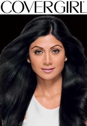
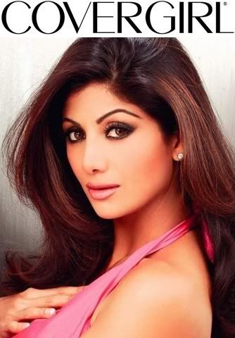
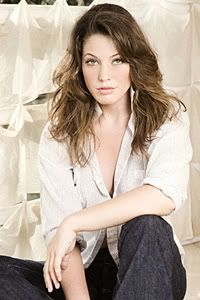
Amanda: I hate to break it to you, but your lipstick photo is awful. It looks very Photoshopped and inauthentic, plus I don't even know if you're wearing lipstick! Your hair pops first, then your eyes... I hardly pay any attention to your lips at all. Your lips are shown much better in the second one. Sorry Shilpa, but after this shampoo ad, you're in trouble.
The mascara photo looks very familiar - it was your avatar last season. I must say I quite like it for a mascara ad. I love the hair, but the effect at the bottom might be a bit too much for CoverGirl. Everything else about it is great, so it gives you some hope. Good work on this one!
Emma: I'm afraid that I'm also not a fan of the lipstick photo. The product is there, and it's by no means bad, but it doesn't really have the emphasis and centrality that we look for in a Covergirl shot. And that's really too bad, because the rest of the photo is actually quite stunning. The hair is amazing, and the facial expression is delightful, but the product placement just isn't there.
The mascara photo, however, is in an entirely different class. You showcase the product amazingly well, and you do it in a way that's non-traditional without being totally removed from the typical Covergirl style. That's a hard medium to hit, but I'd say you nailed it. Well done on this!
Émilie: Your lipstick photo is the victim of bad photoshopping, and probably would've benefited from some cropping, and some lip colour enhancing in photoshop, especially if you found a bigger photo of it. It's not a bad photo per se, it just doesn't fill the brief. If it were a different product for covergirl, it may have worked better. Your lips do look good, but it's not the focus point here.
Your mascara photo. Every judge and their cat knows this is the photo I had wanted you to use for mascara. The mascara is the central focus, plus it's classy, sophisticated, and very non-traditional to CoverGirl, but still works, as Emma said, that's a hard thing to do.
Yoona: I actually like the lipstick one better than the mascara. I think you look fresh, very beautiful and the color of your lipstick is really good with your skin tone. I'm so tired with the lipstick ad which gave us the model with the red lipstick. Not everyone can look great with the red lipstick. I think you picked the right color for yourself. As for the mascara, it was a great photo but again no "Shock Value" for me.

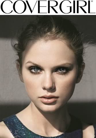
Yoona: Your lipstick photo is so breath-taking. I love it so much. Different approach but brilliant result. Very fresh and commercial. I love the energy that you gave us in this photo. For your mascara one, same as Ashley. I think it was too gloomy for a Covergirl shoot. You want to approach people to by product. Good photo but to gloomy. Other than that, good luck Taylor and yes that was long
Émilie: Your lipstick photo is beautiful, but I find it just doesn't fill the brief of the CoverGirl. This is mainly due to the fact of the angle, and how prominent your headband is. The angle of your face is showcasing the headband more than your lips, and that's a problem. There were other shots from your Seventeen shoot that would've worked better. It's beautiful photo, but it doesn't fill the brief.
Mascara is very dark, and gloomy, and that's not right for CoverGirl. When CoverGirl does dark and high-fashion, they do it boldly, and for me, it's not really bold enough here. It's a beautiful photo, but I'm agreeing with Yoona. I believe your CoverGirl Naturelux Silk Foundation photo would have been a lot better, in my opinion.
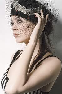
Amanda: I really dislike your lipstick photo. One reason why: That flower is huge. I almost cannot see the lipstick because my eyes keep staring at that ginormous thing. I guess it may just be personal preference... lol?
Your mascara one is good but not great. It highlights the product well but isn't completely memorable. Still I like it so it isn't that bad!
Good luck and may your life improve soon!
Emma: I find the lipstick one quite interesting. I do think the flowery bits distract from the lips a bit, but the pose and facial expression are delightful, and really make the photo something memorable.
The mascara one... I'm iffy on, to be honest. The facial expression is quite intense, but the mascara itself doesn't really stand out for me, and that might just be because I'm a straight guy who doesn't know a hell of a lot about makeup, but overall it's not quite as strong as the lipstick photo. Still, good luck, and hope things turn out alright.
This is probably the toughest week this cycle either for you models or us judges. For this week you need to come up with 2 different Covergirl Ad for 2 different products. LipPerfect LipColor & Lash Mascara. Mr. Alex couldn't be with us today. He's a little bit busy and let's hope he will be back for the Finale next week
Let's start our judging session


Amanda: That lipstick is sexy. You look really formal and your face steals the show. I also see the mascara in that one, but the color of the lips catches my eye immediately. Your hair is great and the outfit is fine given the cropping of the image. It's a fantastic shot all around. Great work!
The mascara photo, unfortunately, doesn't do anything for me. It's sort of plain and unmemorable, and the image seems to be a little grayish. That prevents your eyes from popping! I still am drawn to your eyes, and I know you're trying to avoid re-using an old photoshoot, but this isn't as good as some of the other things we've seen from you. I know you can do better than this.
That lipstick one is still amazing so you should be good

Emma: I quite like the lipstick one. I've been iffy on quite a number of your recent photos, because I feel like it's been the exact same facial expression every single time, but this one is different and fresh, and I like it for that reason alone, not to mention that it's just overall an amazing shot.
The mascara one, however, does tragically tend to fall once more into the "generic Ashley face" that we've seen ten trillion times in this competition. The hair is reasonably nice, and we do get a good sense of the mascara, but it does kind of drag my overall impression down pretty substantially.
Émilie: Your lipstick photo is AMAZING! It's very much what CoverGirl is aiming for nowadays, with a more high-fashion, or classy look. You look classy and sophisticated, and young women will want to buy that product because they can look classy and sophisticated too.
Your mascara one is incredibly awkward, though we do see the mascara, you look unhealthy. Your skin is not glowing. The consumer may think that this product may end up making them look unhealthy too. That's not what we want for CoverGirl.
Yoona: Wow for your lipstick photo. Very fierce and strong. I love this side of you so much. I get the energy and confident from you girl. As for your mascara, I was a little bit surprised because I expected you to do better for this one with your big eyes. A little bit gloomy for a Covergirl shoot


Yoona: I love your look in the mascara one. Very edgy, fierce and you have a beautiful eyes. As for the lipstick, I'm not a fan of your expression here. You look very lost. It's very contrast to your mascara photo which i think suit you better, Natalie
Emma: I agree, the mascara photo is absolutely amazing. The product is showcased beautifully, and while the hands are a bit of detraction for me, that's a minor quibble. Nice work!
However, the expression in the second photo really doesn't do it for me. You almost look nauseous, rather than sexy, and the glare off the earring steals quite a lot of the attention from your face. The lipstick also isn't quite as prominent as I'd like, and I blame that on the lighting of the photograph. Still, it's not terrible or anything...
Amanda: Your mascara one is awesome and highlights your eyes gorgeously. Really nothing bad to say about it!
I think your lipstick one is good but not great. Your expression is sort of awkward and this doesn't completely feel like it could be an ad. Part of it is the angle and I concur about the earring - it's too focal. I still like it for some reason but don't expect me to put you first for this. Overall though, great work!
Émilie: You and Shilpa are the only girls in the competition so far to choose a photo I actually wanted you to pick. This is definitely high-fashion and edgy, and it shows the mascara off really beautifully. The hands may not be right for CoverGirl completely, but this is almost the type of high fashion photo that CoverGirl would use for their ad.
Your lipstick one is your weak one here. You look uncomfortable, a bit constipated and really awkward. You don't make me want to buy that lipstick, in fact, I don't want to try it, it looks like it could be a laxative. Hahaha. I'm going to agree with the others about the earring.


Amanda: I'm not completely sure about the lipstick one here. It looks nice, yeah, but the pose and angle are sort of awkward, so your shoulder is in front of your mouth. That sort of takes the focus somewhat off of your mouth. It's good, but it isn't great or overly memorable - and at this stage of the game, that could be a problem.
The mascara shoot... wow, your eyes are fantastic. I do take issue with the neck, however, since the angle of it looks sort of weird, but that's not too big an issue for me. My attention is immediately drawn to those eyes, and that's what we want here. Great job on this one!
Emma: I like both of these quite a bit. The lipstick one looks like it could be a real Covergirl ad, with the caveat that the cropping is rather unfortunate. The top of your head is cut off, and that really kind of shifts the focus a bit lower than it's intended to be. That being said, the lips really pop quite nicely here, and the hair is also well done.
The mascara shot is absolutely gorgeous, and I honestly can't think of a single negative thing to say about it. Incredible work!
Émilie: Actually, I have news for you, Emma: They both are actual CoverGirl ads. Rihanna is a real life CoverGirl, after all.
This shoot was a little too easy for you, as Rihanna had ads that work for both of the actual products given. I would've loved for you to take a risk and choose something that wasn't actually for CoverGirl.
The first one, it's easy, breezy, beautiful. It's the covergirl style, and you look approachable and relatable. The lips are the central point of this advertisement, and they look amazing. It's a very girl next door look, and reminiscent to the classic CoverGirl style.
The second is a newer CoverGirl style photo. As you know, short hair makes your bone structure pop out, but your bone structure, your neck and your lips look really uncomfortable and forced. As for the product yes, it's showcased beautifully, but I am still unsure about the uncomfort in the photo. It sort of takes away from the CoverGirl look. "She looks good, but she doesn't look comfortable. Maybe this product is giving her a bad reaction to her skin. I shouldn't buy this." Just one scenario.
Yoona: I think you came up with both strong photo this week. I love the lipstick one better than the mascara. I think the color looks great on you. As for the mascara the angle wasn't great. Look at your neck. But the execution for both photo were nicely done this week. Going to be super hard for us judges this week


Amanda: I hate to break it to you, but your lipstick photo is awful. It looks very Photoshopped and inauthentic, plus I don't even know if you're wearing lipstick! Your hair pops first, then your eyes... I hardly pay any attention to your lips at all. Your lips are shown much better in the second one. Sorry Shilpa, but after this shampoo ad, you're in trouble.
The mascara photo looks very familiar - it was your avatar last season. I must say I quite like it for a mascara ad. I love the hair, but the effect at the bottom might be a bit too much for CoverGirl. Everything else about it is great, so it gives you some hope. Good work on this one!

Emma: I'm afraid that I'm also not a fan of the lipstick photo. The product is there, and it's by no means bad, but it doesn't really have the emphasis and centrality that we look for in a Covergirl shot. And that's really too bad, because the rest of the photo is actually quite stunning. The hair is amazing, and the facial expression is delightful, but the product placement just isn't there.
The mascara photo, however, is in an entirely different class. You showcase the product amazingly well, and you do it in a way that's non-traditional without being totally removed from the typical Covergirl style. That's a hard medium to hit, but I'd say you nailed it. Well done on this!
Émilie: Your lipstick photo is the victim of bad photoshopping, and probably would've benefited from some cropping, and some lip colour enhancing in photoshop, especially if you found a bigger photo of it. It's not a bad photo per se, it just doesn't fill the brief. If it were a different product for covergirl, it may have worked better. Your lips do look good, but it's not the focus point here.
Your mascara photo. Every judge and their cat knows this is the photo I had wanted you to use for mascara. The mascara is the central focus, plus it's classy, sophisticated, and very non-traditional to CoverGirl, but still works, as Emma said, that's a hard thing to do.
Yoona: I actually like the lipstick one better than the mascara. I think you look fresh, very beautiful and the color of your lipstick is really good with your skin tone. I'm so tired with the lipstick ad which gave us the model with the red lipstick. Not everyone can look great with the red lipstick. I think you picked the right color for yourself. As for the mascara, it was a great photo but again no "Shock Value" for me.


Yoona: Your lipstick photo is so breath-taking. I love it so much. Different approach but brilliant result. Very fresh and commercial. I love the energy that you gave us in this photo. For your mascara one, same as Ashley. I think it was too gloomy for a Covergirl shoot. You want to approach people to by product. Good photo but to gloomy. Other than that, good luck Taylor and yes that was long

Émilie: Your lipstick photo is beautiful, but I find it just doesn't fill the brief of the CoverGirl. This is mainly due to the fact of the angle, and how prominent your headband is. The angle of your face is showcasing the headband more than your lips, and that's a problem. There were other shots from your Seventeen shoot that would've worked better. It's beautiful photo, but it doesn't fill the brief.
Mascara is very dark, and gloomy, and that's not right for CoverGirl. When CoverGirl does dark and high-fashion, they do it boldly, and for me, it's not really bold enough here. It's a beautiful photo, but I'm agreeing with Yoona. I believe your CoverGirl Naturelux Silk Foundation photo would have been a lot better, in my opinion.
Amanda: I really dislike your lipstick photo. One reason why: That flower is huge. I almost cannot see the lipstick because my eyes keep staring at that ginormous thing. I guess it may just be personal preference... lol?
Your mascara one is good but not great. It highlights the product well but isn't completely memorable. Still I like it so it isn't that bad!
Good luck and may your life improve soon!
Emma: I find the lipstick one quite interesting. I do think the flowery bits distract from the lips a bit, but the pose and facial expression are delightful, and really make the photo something memorable.
The mascara one... I'm iffy on, to be honest. The facial expression is quite intense, but the mascara itself doesn't really stand out for me, and that might just be because I'm a straight guy who doesn't know a hell of a lot about makeup, but overall it's not quite as strong as the lipstick photo. Still, good luck, and hope things turn out alright.


 . It was really tough girl but you did really great again this cycle. Really good to have you here.












 I can not believe it! Sorry to see you go, Rihanna & Taylor

